Have you ever wondered what is the pattern/ inscription on your coffee mug or on your clothing tag doing there? Well, that’s a logo; a company’s primary source of identity.
In today’s world, logos are such a common occurrence that we hardly realise that we’ve seen one. In such competitive times, a company needs to put in extra efforts to make their logo and brand stand out. In this blog, I will be walking you through a few logos that have stuck with me and endured the test of time.
More often than not, logos are not just mere patterns or designs that tell you a brand’s name. They have deep rooted meanings and are symbolic of a brand’s history, ethos and values.
As a child, I loved watching Disney’s animated movies like Cinderella and Snow White but I never put much thought into the studio making it. Today, as an artist and a professional, the logo of Disney and its story has me mesmerised.
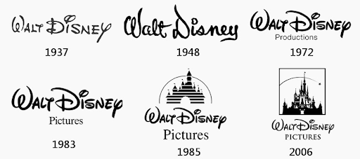
Designed by Walt Disney and Ub Iwerks in 1928, the logo has undergone numerous revisions over the years (with the latest update being rolled out on November 01, 2022). Through years of financial struggle and obstacles, Walt Disney stood by his dream and the widely acclaimed logo we see today is a testament to his dedication. The logo animation is done in such a way that it creates an ambiance of magic and adventure. The castle represents the company’s focus on storytelling and imagination. It takes any viewer to a world of wonder even before the movie starts.
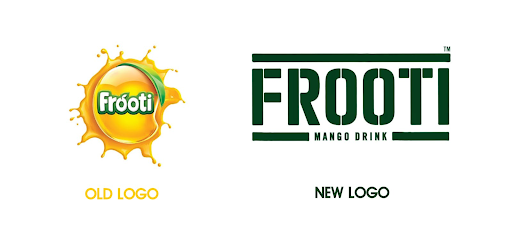
Movie time used to be accompanied by snacks and drinks for me. I would grab a packet of lays and a Frooti every time I got a chance to binge a movie! The excitement of watching a movie and sipping on a sweet mango, kept me away from noticing the essence of the Frooti logo.
The Frooti logo is simple yet amazing. It looks like a crate of mangoes. It conveys that the mangoes used to make Frooti are super fresh and are directly brought to you from the farm.
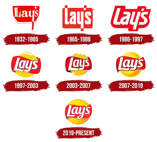
As a brand, Lays knows exactly what they want to tell their customers. The ‘Lays’ logo has a potato/ chip with a red ribbon surrounding it, showing that it is a premium quality snack.
From selling chips in paper bags to establishing one of the most widely sold brand of chips, Herman W. Lay put in a lot of effort to establish his company. The logo, evolving with the company’s success is a mile marker for every achievement that Lays has made.