Typography is the art of arranging letters and text in a way that makes the copy legible, clear, and visually appealing to the reader. It is a field that entails much more than just choosing beautiful fonts. From making words legible, to evoking emotion, or creating a consistent brand identity, typography can really set the tone for your brand. Not only that, it is also a vital component of user interface design.
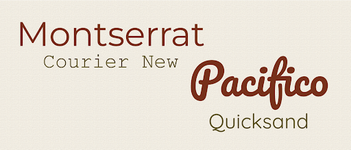
The essence of typography is Fonts, as they are the first thing we notice even before we start reading. Each type of font has a tone and identity associated with it, which should ideally be kept in mind before choosing to integrate it in your brand identity. Broadly speaking, fonts are clubbed into families on the basis of their appearance and the traits they imbibe.
3 Common Fonts you should know about -
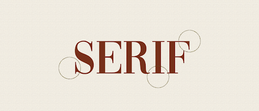
Serif:
The Serif font is quite well established and is often associated with a more romantic, elegant or even formal outlook. It is one of the most popular fonts and has widespread use.
These typefaces are a great fit for brands and industries who want to establish themselves as classic and timeless.
Brand Example : ZARA

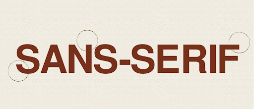
Sans-Serif :
The Sans-Serif fonts are a more up-to-date, & sophisticated version of the Serif font. They represent a clean, minimal, friendly and modern identity.
These typefaces are a great fit for any brand which wants to be viewed as innovative, bold, and refined.
Brand Example : JEEP

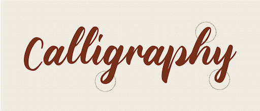
Calligraphy :
Calligraphy fonts appear to be written with a pen. They bring a more personal touch to the content. Calligraphy is the most fancy, creative, happy and to some extent even whimsical category of fonts.
They are well suited for brands that want to establish a strong associated brand identity which is youthful, fancy, and optimistic.
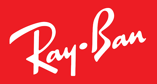
Brand Example : Ray-Ban
Typography Elements to enhance your content -
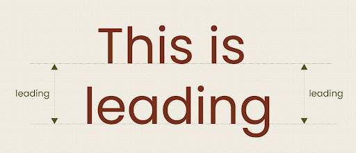
Leading:
The word ‘leading’ originates from the strips of lead hand-typesetters used in the olden days to evenly space out lines of text. It’s a typographer’s term for line spacing. Leading is an important practice that instantly enhances the legibility of text. Leading is also used to draw focus or highlight important content.
Kerning:
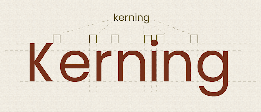
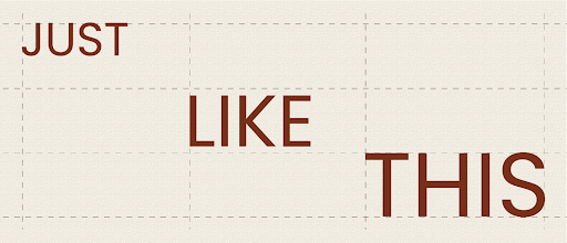
Kerning implies the spacing between individual letters in a word. It is used extensively in logo design. Unlike tracking, which adjusts the amount of space between the letters of an entire word in equal increments, kerning is focused on how type looks — creating readable text that’s visually pleasing.
Alignment:
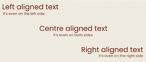
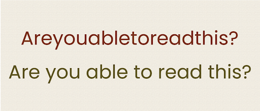
Alignment refers to formatting of text into an equal size, space, and distance between the elements. The term “alignment” refers to the “line” that the text is oriented towards. The default for long text is usually left alignment, while centre alignment is extensively used for headings and titles. These alignments should be graciously used to draw attention to important points.
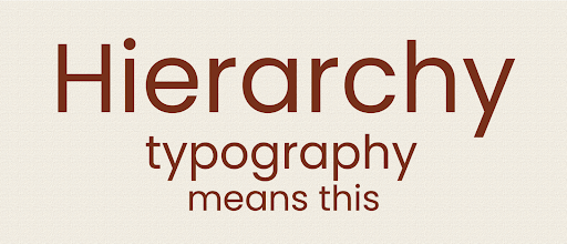
Hierarchy:
Hierarchy helps to catch the reader’s eye and focus on the highlights in the text. It allows viewers to navigate content easily, know where to start and where to go next.
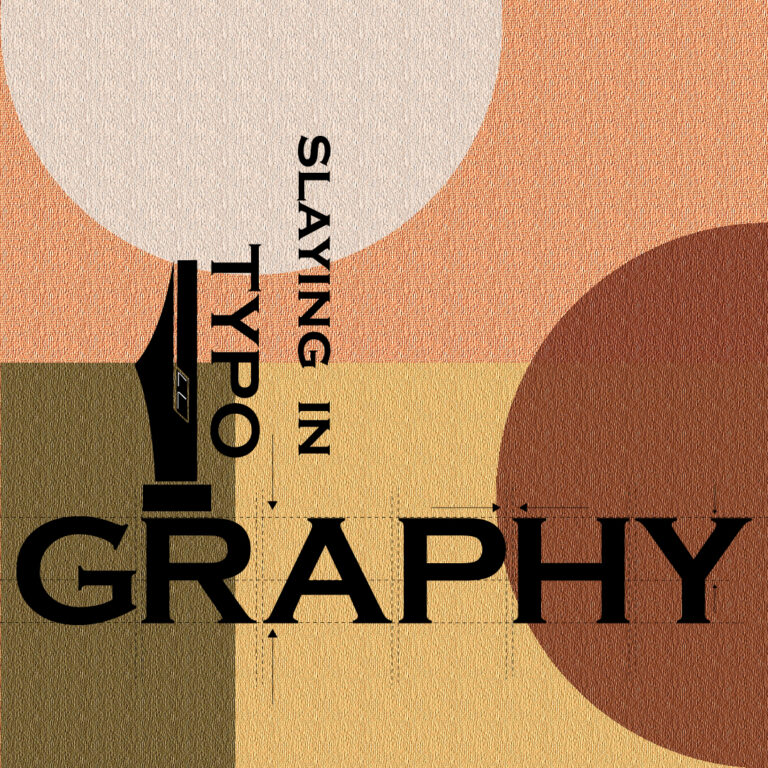
Tips to Slay in Typography
Prioritise Readability:
Readability refers to the ease of browsing through a piece of content. Choosing the right colour, size & font plays an important role in the readability of content. The goal of typography should be to achieve higher readability.
Work with grids:
Grids have multiple uses like aiding in alignment and balance of designs, achieving cool effects such as diagonal typography and many more. Professionals use grids to design content that enhances visibility and improves focus on important elements while maintaining symmetry.
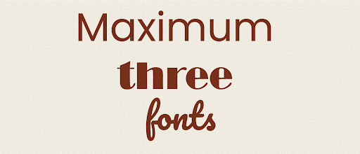
Choose maximum 3 Typefaces:
Just like too many cooks spoil the broth, too many fonts is a recipe for poor content. Choosing more than 3 fonts can spoil your interface. More often than not, two typefaces are enough to cover all your design needs. You can even get by with one typeface, using its different styles, and you will not lose anything.
Contrasting Font Pair:
While creating a font pair, it is important to choose fonts that look visually different. At the same time, too much contrast leads to a shabby product. Always choose distinct fonts that look attractive together.
For example, you can combine serif typefaces with sans serif, or combine Bold and Regular or Light styles within one typeface.
Divide Text into Paragraphs
There is no doubt in the fact that attention span is not what it used to be. In the modern world, it is more difficult for people to perceive large volumes of texts. Dividing text into paragraphs gives a much needed visual break to the readers and makes the overall content look clean.
If you want your text to be read, break it into paragraphs according to the principle: one thought—one paragraph.
Typography is a crucial element in today’s content heavy world. It is the one thing that will help your brand stand apart from the crowd.
You are now fully equipped to slay in typography!