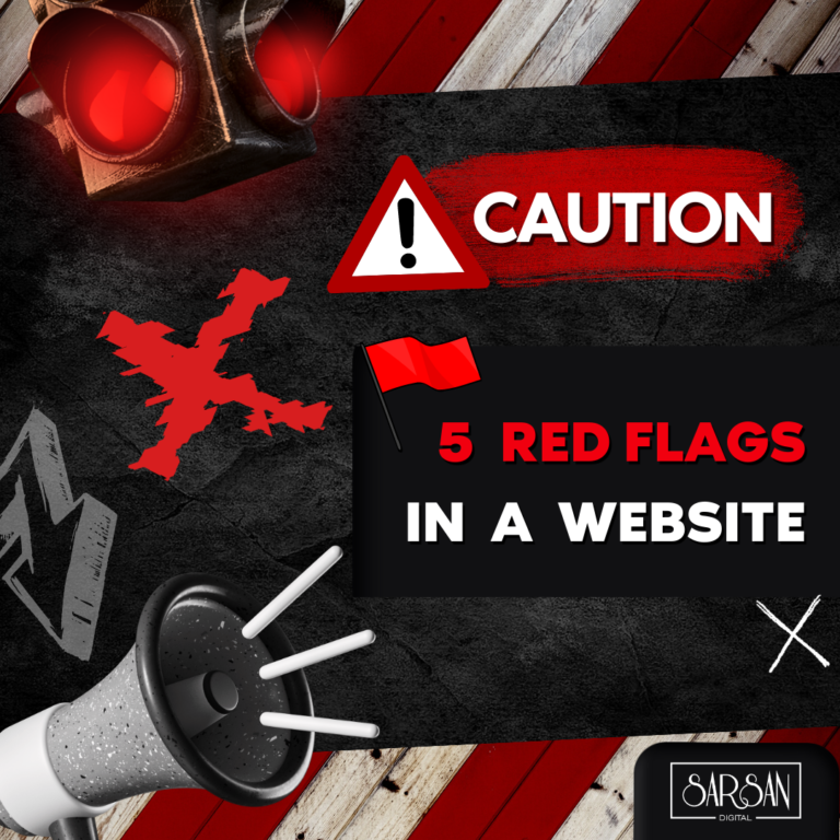
Red flags in a website refer to warning signs or potential issues that may indicate a problem or risk. These can include things like typos or grammatical errors, outdated or irrelevant information, unprofessional design or layout, lack of contact information, or security concerns such as a lack of encryption or visible trust seals. It’s important to be aware of red flags when browsing websites, as they can indicate that a website may not be trustworthy or reliable.
Lack of content information on website
One of the main drawbacks of not having enough content on a website is that it can make the site appear incomplete or unprofessional. This can give visitors the impression that the website or the business it represents is not well-established or trustworthy, which can discourage them from engaging with the site or making a purchase.
Additionally, having insufficient content on a website can make it difficult for search engines to properly index the site, which can impact its search engine rankings and make it harder for potential customers to find the site through search. Not having enough content on a website can negatively impact the user experience and make it less effective at achieving its goals.
Solution to the problem of not having enough content on a website is to simply add more content to the site. This can include adding new pages, blog posts, or other types of content that provide valuable information to the site’s visitors. By providing more information and resources, a website can become a more useful and engaging destination for its users.
Another solution to the problem of lack of content on a website is to make better use of the content that is already on the site. This can involve reorganizing the site’s content in a way that makes it easier for users to find what they are looking for, or adding new features or functionality that helps users engage with the content in new and interesting ways. For example, a website could add a search bar or a navigation menu that makes it easier for users to find specific pages or pieces of content.
The key to addressing the problem of lack of content on a website is to focus on providing maximum value to the site’s users.
Laggy Website
A laggy website is a website that takes a long time to load or respond to user interactions. This can be frustrating for users and can lead them to leave the site before it has a chance to fully load. There are a number of potential causes of a laggy website, including a slow internet connection, a large amount of high-resolution images or other media on the site, or a lack of optimization on the part of the website’s developers. In some cases, a laggy website may be the result of the website receiving a large amount of traffic, which can overwhelm the server and cause delays.
To avoid these problems, it is important for website owners to ensure that their site is optimized for speed and performance. This may involve optimizing the site’s code, reducing the amount of media on the site, or using a faster and more reliable hosting provider. By taking these steps, website owners can improve the user experience and ensure that their site is able to handle a high volume of traffic seamlessly.
Unresponsive Button
An unresponsive button on a website can be frustrating for users and can prevent them from completing a desired action, such as making a purchase or signing up for a newsletter. There are a few potential causes of an unresponsive button on a website, including a coding error on the part of the website’s developers, a slow internet connection, or a problem with the user’s device.
One solution to the problem of an unresponsive button on a website is to check the website’s code to ensure that the button is properly linked to the desired action. This may involve checking for any errors in the code or making sure that the button is properly formatted and positioned on the page. In some cases, an unresponsive button may be the result of a slow internet connection, in which case the user may need to try accessing the website from a different location or with a faster connection.
Another solution to the problem of an unresponsive button on a website is to suggest the user to try clearing the cache and cookies, as these can sometimes interfere with the website’s functionality. You can also add suggestions to try accessing the website from a different device, such as a smartphone or tablet, for a better experience.
Unresponsive buttons can affect conversions drastically, and hence should be keenly checked.
Complex and poor user experience
A complex and poor user experience on a website, which can lead to a high bounce rate and a decrease in conversions. A poor user experience can be caused by a number of factors, including a cluttered or unorganized layout, a lack of clear navigation or information, or a lack of responsiveness or usability on mobile devices.
To address the problem of a complex and poor user experience on a website, it is important to take a user-centric approach and focus on making the site as simple and easy to use as possible. This may involve conducting user research and testing to understand the needs and preferences of the site’s target audience, and using this information to inform the design and organization of the site.
Another important step in improving the user experience on a website is to make sure that the site is responsive and works well on a variety of devices, including smartphones and tablets. This may involve using responsive design techniques, such as flexible grids and images, to ensure that the site’s layout and content adapts to the size and resolution of the user’s device. By making the site responsive, website owners can ensure that users have a positive and consistent experience regardless of the device they are using.
By doing so, website owners can improve the user experience and their chances of generating leads and making sales.
Poor color scheme
A poor color scheme can be caused by a number of factors, including the use of colors that are difficult to read or that do not work well together, or the use of colors that do not align with the website’s branding or message.
To address the problem of a poor color scheme on a website, it is important to carefully select colors that are easy to read, that work well together, and that align with the website’s branding and message. This may involve conducting user research and testing to understand the needs and preferences of the site’s target audience, and using this information to inform the selection of colors for the site.
Another important aspect of a good color scheme on a website is consistency. The colors used on the site should be used consistently throughout the site, and should not change abruptly from page to page. By creating a consistent color scheme, website owners can create a cohesive and professional-looking site that is easy for users to navigate and engage with.
These are 5 major red flags to look out for while browsing to test the authenticity of any website. As developers you should ensure that your website has none of these red flags. These basic checks will enhance user experience substantially and will form a basis for further SEO and optimization efforts.
Happy Browsing!